🏃♀️ W-2 Abandonment on Credit Karma Taxes
I re-designed the Wages and Income topic catch-all screen to reduce abandonment during peak tax season.
📅 Jan 2024
🧠 Product Design / User Research / Prototyping
🛠️ Figma

🏡 Background
In December 2023, we launched a seamless tax filing experience for Credit Karma members to file their taxes without having to leave the Credit Karma product.
We recognized key abandonment areas in the end-to-end tax filing flow to tackle and swarm for peak season.
We saw high abandonment in the Wages and Income topic section (around 13.5%), and saw 9.77% abandonment on the catch-all screen.
🤔 User problem
Credit Karma members can’t upload their tax docs because their docs are either unavailable or members do not know how to access them. Thus, resulting in stress and abandonment
💡 Hypothesis
If we add relevant content to the catch-all screen to clarify common questions regarding W-2, then members will not abandon when they feel stuck, which we will measure success by 1% improvement in abandonment reduction and .5pt increase in completes.
🔎 Existing experience analysis
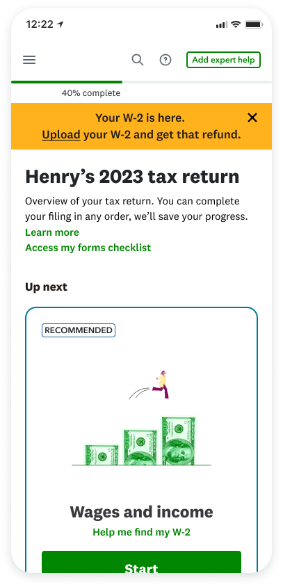
When a user enters the Wages and Income topic section, the first screen is the "catch-all” screen where we see 9.77% abandonment. The existing design of this screen does not provide the user with any additional information regarding W-2s. Additionally, it is not user-intuitive that users can skip this section if they aren’t ready. I questioned how might we be able to highlight information regarding W-2s if users have additional questions regarding their tax documents?
Our existing experience
🤓 User research
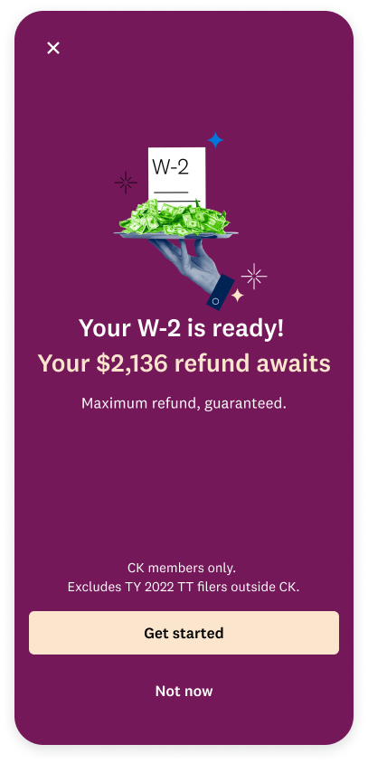
Through customer interviews, we found that among TY22 abandoners who were likely to return, most were waiting for tax docs. As tax season progresses, needing tax docs declines while needing a break increases
“Not ready to file taxes” was consistently cited as the top reason of abandonment during onboarding.
💭 Considerations for next steps
For an improved in-product design and experience, it was concluded that we cannot assume users know much about their W-2 and tax documents. Therefore, we must provide as much information to them to help them grow their confidence in their taxes.
🚧 Constraints
I had to keep in mind the constraints and technical feasibilities of creating this experience. One of the biggest constraints was that this was a 2 week swarm within peak season; so we only had about a week to design. Due to the time constraint, we were advised against creating designs that would require a heavy dev lift.
🧠 Brainstorming
Before we narrowed to working on the Wages and Income topic section, we identified the top abandonment sections in our end to end. This included 1) Wages and Income, 2) Final Review, and 3) Authentication. I was partnered with another designer to tackle these abandonment topics and come up with scrappy designs. We took about 2 days to come up with some designs and presented them to our cross functional partners. As a team, we collectively agreed to focus on one section due to time constraints. We narrowed to the Wages and Income section because we saw the highest abandonment rates happening here.
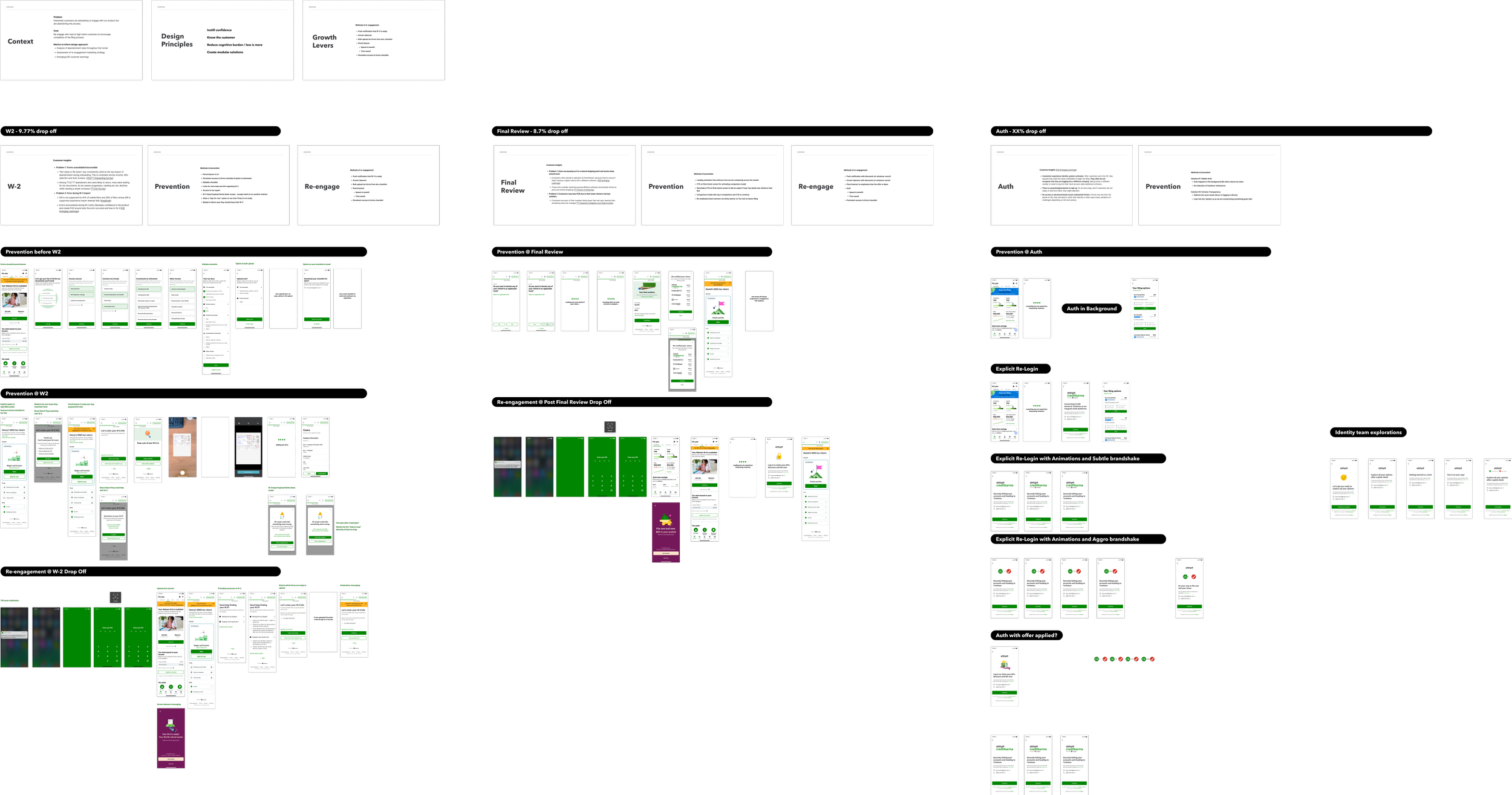
Initial brainstorming
🤏 Narrowing designs
After narrowing to focus on the Wages and Income section, we brainstormed again. One of our design principles for this project was to create modular solutions. Due to the fact that this project was a swarm and we had little time to iterate, we wanted to make sure we were designing for modularity. Additionally, because we were forced to focus on one abandonment area, we wanted to create designs that could be leveraged in other high-abandonment areas within our experience.
We took 2 days to create intervention models that worked within our design system, and we presented these designs to our cross-functional partners later in the week.

Option 1: Screen takeover
Pros:
Urgency messaging with screen takeover
Easily visible information
Cons:
Additional screen to an already long experience
Users may have more questions after seeing this screen

Option 2: “Skip for now” option in Tax Hub
Pros:
Allows user to skip this topic section if they are not ready
User can easily come back through Tax Hub
Cons:
If user ends up skipping every section, where do we lead them to?
May not be dev-feasible
Option 3: Pencil banner
Pros:
Alert user quickly with important information
Clickable CTAs to help user get started in this topic section
Cons:
User may accidentally dismiss the banner and lose information
User still may not know where to find their W-2

Option 4: Modal intervention
Pros:
Alert user which forms they need to continue this section
Ability to skip section if still not ready
Helpful links regarding W-2
Cons:
Adding a screen to an already long experience
What would CTA destinations look like? This would add additional screens

Option 5: FAQ on catch-all
Pros:
Information all in one place
FAQs condensed to one screen
Easily access an expert for any additional questions
Cons:
More text/reading
More CTAs
After considering all the trade-offs in these designs, we decided to move forward with Option 5. This seemed to be one of the more dev-feasible options, and this option tackled the key abandonment screen without additional screens.
📄 Design proposal
I worked with our content AI tool to create some content filler regarding W-2 to present to our stakeholders for our design proposal.

Proposed design
🎯 Finalizing designs & addressing technical feasibilities
After async reviews with my design team and presenting to our stakeholders, I changed the design of the FAQ by removing the utility icons. The reason being was that the screen was becoming overwhelming. Additionally, we ran into some feasibility issues. Our engineers let us know that adding an expert CTA for this swarm was not feasible. Adding another CTA would have caused additional routing and our engineers did not have enough sprints to add in that feature. Although the expert CTA was one of the key points in this design, we decided to continue on. In addition to removing the expert CTA, I had to work closely with both our researcher and content designer to understand what questions users were asking regarding their W-2. We took inspiration from the IRS site as well as our tax articles and community blog posts.
🔔 Where we are today
New baseline experience
We ran this experience as a go-do in January 2024. We saw the new design had 2% decrease in abandonment- which was a 15% performance improvement. We also saw that .2pt users were completing the tax filing experience with the new design.
🔁 In retrospect
Kudos to the whole team for swarming on different areas of the tax filing experience. We ran over 10 designs and have continued iterating on certain parts of the flow. Through this experience, I learned to connect with our engineers and data analyst partners early and often. I believe this was the key to our success in swarming fast and scrappily. In hindsight, I would’ve liked to add room for user testing to learn more about our users and how they respond to screens mid-flow.